


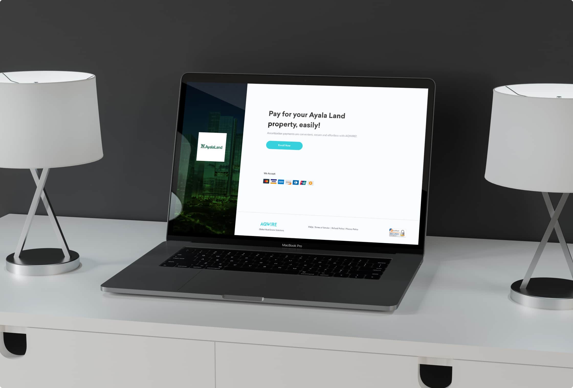
A payment facility for Ayala Land that allows them to offer auto-debit payments for their customers to ease their monthly payment dues.
Ayala Land is the leading land developer in the Philippines. With 11,624 hectares in their land bank, 26 estates, and presence in 57 growth centers across the country, they have a mix of residential developments, offices, shopping centers, and other businesses.
Ayala Land has partnered up with AQWIRE to process cross-border real estate settlements. With this, we helped them design and develop an online payment portal that allows them to collect monthly amortization payments from their customers. Moreover, this portal makes it easier and more convenient for their customers to pay their monthly dues with the auto-debit enrollment feature.
With the current auto-debit feature of AQWIRE, we wanted to review its design and user flow to accommodate the needs and requirements of our client, Ayala Land. Moreover, our goal is to ensure that the customers will use the platform and retain them after their first payment.
Currently, there are not many property developers that use AQWIRE’s auto-debit enrollment. According to those who are using this, customers don’t use the platform after their first payment. This raises the question of how AQWIRE can retain its customers to pay on the platform after their first payment.
The challenge is to redesign the auto-debit enrollment by rethinking its user goals and task flows. The redesign is to make the customers return after their first payment and use the auto-debit enrollment for their recurring payments.
Our approach for this design challenge is very straightforward. We aim to incorporate the key phases of Discovery, Definition, Ideation, and Implementation in all of our projects.

The team conducted a meeting and interview with different departments that are involved with client communication and implementing the feature. This helped us to gather comments and suggestions from stakeholders, and also collate all the feedback from property developers and their customers. This gave us a chance to break down the problems that may affect the usability of the existing auto-debit enrollment.
Based on the meeting that we had, these are some of the concerns and problems we have with our current auto-debit enrollment:
We reached out to some of our friends and family and asked them about their auto-debit transactions and if there are any problems they encountered. The number one problem that they encounter is the lack of notification from the bank or the brand. In addition to this, they also are having difficulty tracking their payments and canceling their auto-debit payment.
While there are disadvantages, auto-debit transactions have grown in popularity over the years as a result of its conveniences and advantages they offer.
Comparing both the problems of our current and general auto-debit enrollment gave us an insight into which problems we should consider solving and what feature is necessary to retain the customers on using the platform.
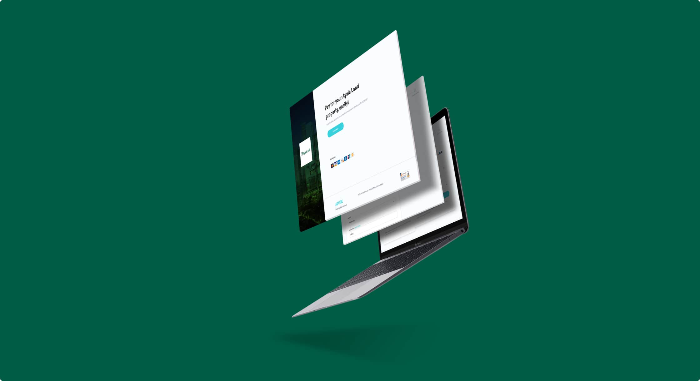
Based on the problems identified, I worked on writing down our user goals and task flows. This allows me to see our user flow without actually creating a single design. Also, this saves us time from doing revisions on the design and it allows us to focus more on the process rather than on the visual.
After defining our user goals and task flows, I quickly created low-fidelity wireframes so I can gather feedback from my team and other stakeholders at this early stage. This allows me to establish the basic structure of the page without actually adding visual design and contents.
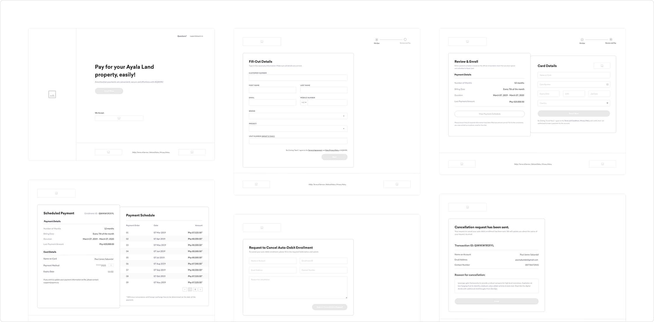
After all the revisions and changes on the wireframe, I have finally finalized it and is now ready for me to proceed with the UI design by creating a high-fidelity mockup and prototype.
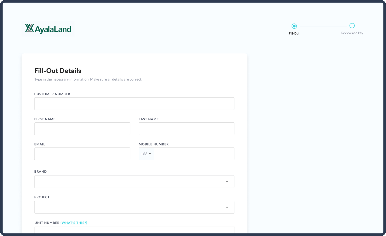
For the first page, customers are to enter the details of the unit and property details. There are two types of customers: with schedule and without a schedule. For those who have a schedule, they will proceed to the next step. For those who are without a schedule, they will be prompted that their application is pending and they are required to settle their first down payment.
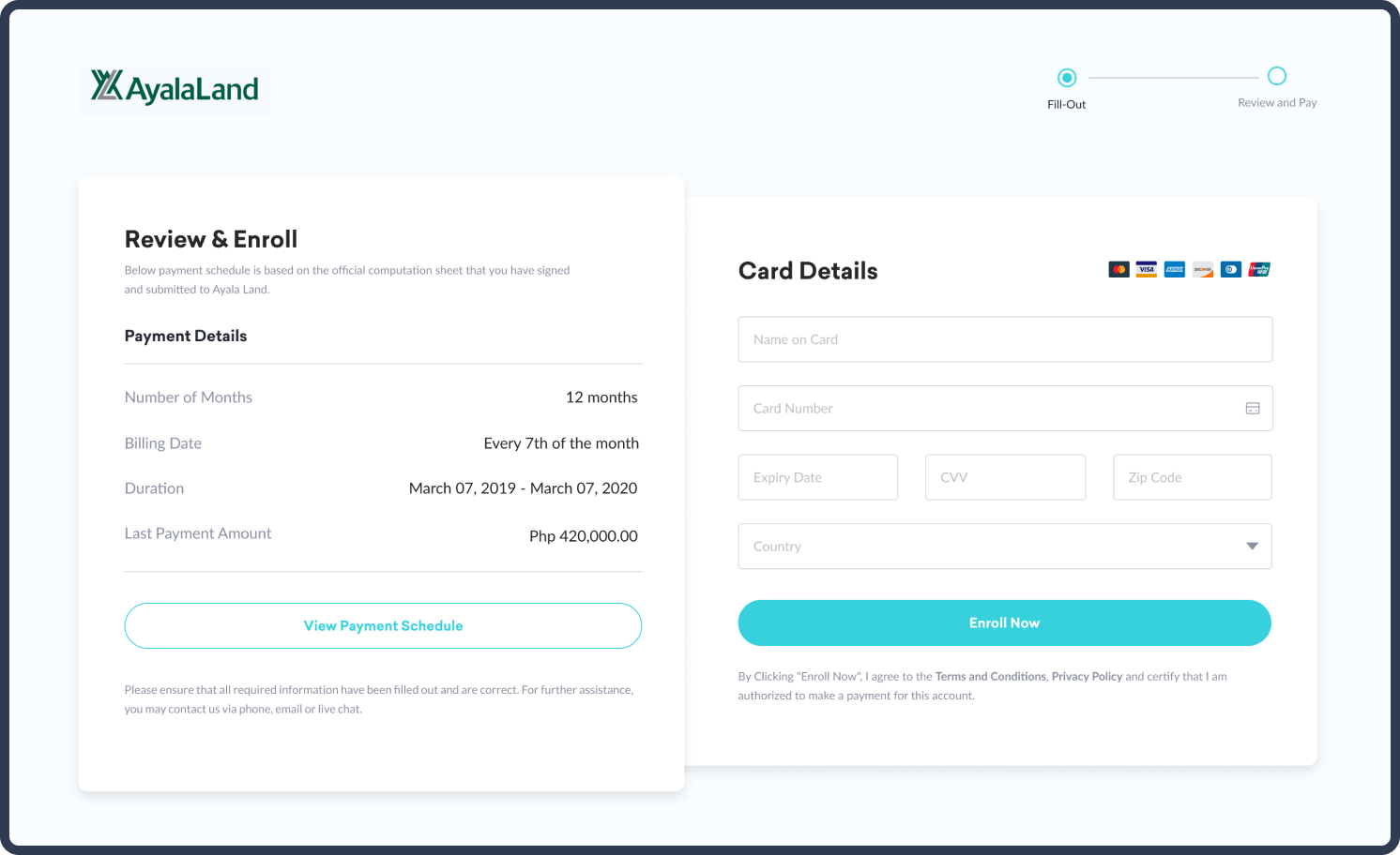
Customers may view their payment schedule on this page and can enter their card details for their auto-debit payment.
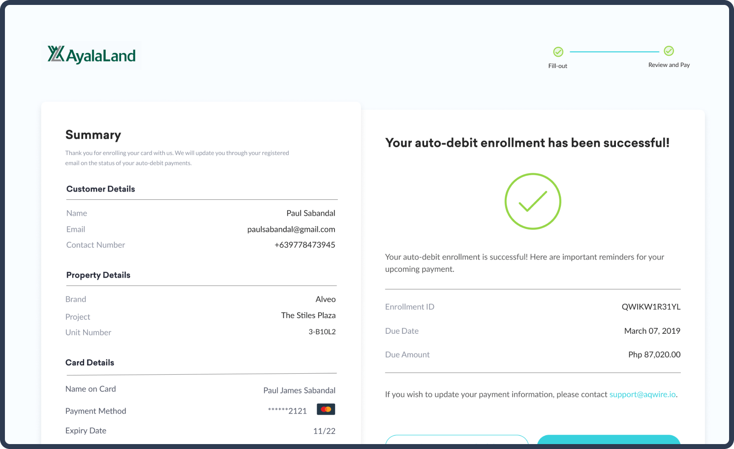
One of the problems with the current auto-debit enrollment is that customers don’t have a way of checking the status of their enrollment. This page allows them to check their enrollment status and see if it’s approved or not. Also, they may view their payment schedule here.
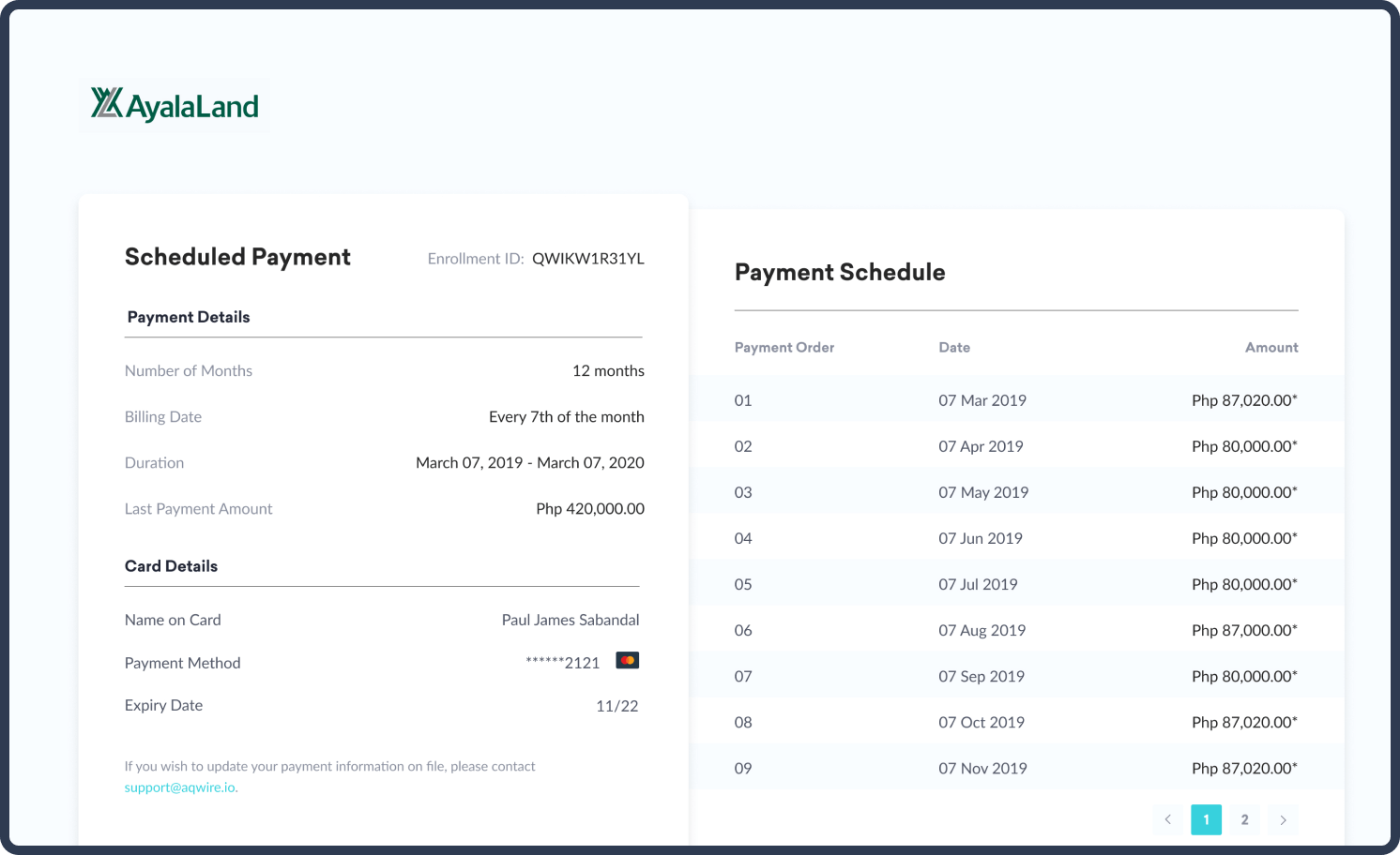
This helps the customer to not lose track of their payments. This page displays when the payment will be charged and how much will be debited in their accounts.
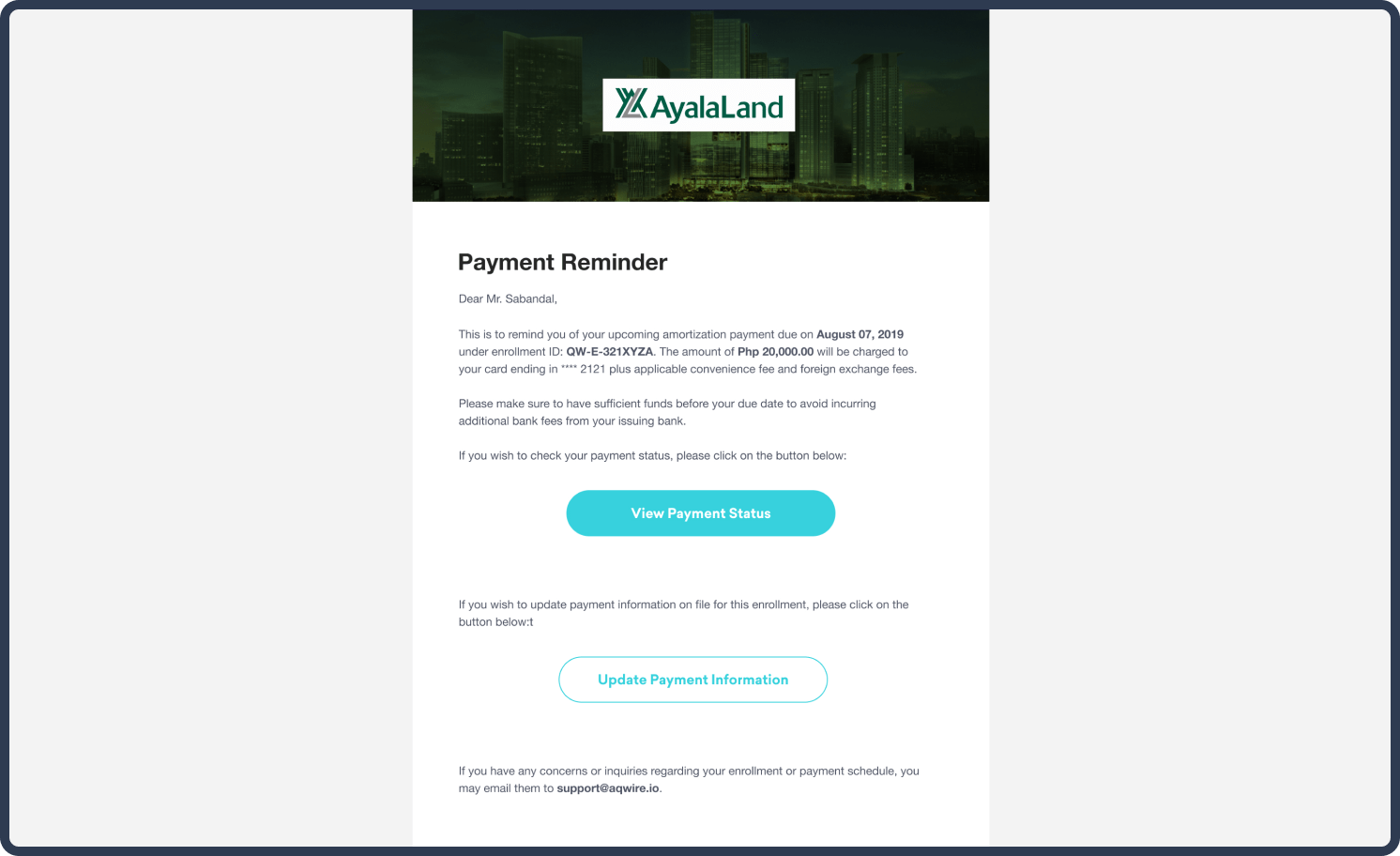
Since one of the main problems for auto-debit enrollment is customers forgetting the date and most of the transactions failed due to insufficient funds. We have decided to send out notification emails to the customers before the agreed date. The team has decided to do a 10-3-1 notification where we send notifications 10 days, 3 days, and a day before the agreed date.
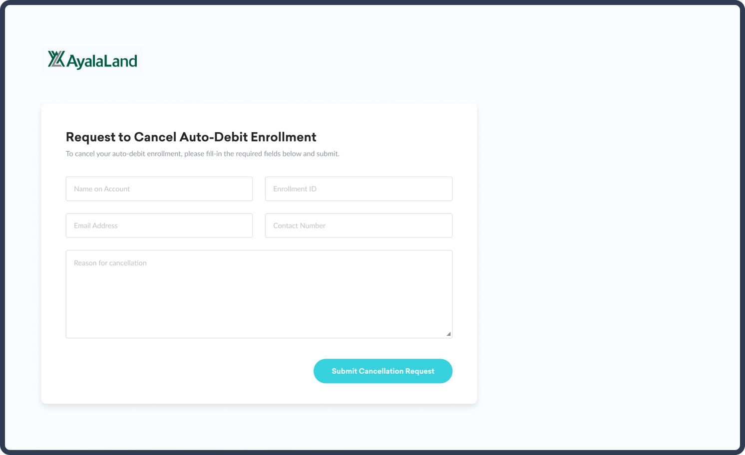
We have provided a page for the customers to cancel their auto-debit payments. This helps them to cancel their payments with ease and without the hassle of calling their banks and the company for cancellation.
Auto-debit enrollment makes it easier for customers to pay their monthly dues. But while there are definite advantages, there are drawbacks as well. Considering these drawbacks, we have revamped and tweaked our payment portal to solve these drawbacks, and to provide customers an easier and convenient way of paying their dues.
Moving forward, we are going to include analytics on our payment portal. This will allow us to track and check the behavior of the customers. With the implementation of analytics, we will have the ability to look at the problems and continuously improve the product in a process that would require less time, effort and development cost.