

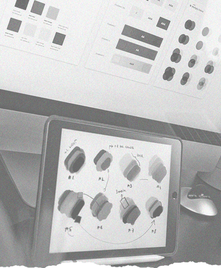
A design system for AQWIRE, a brand that helps Real Estate Enterprises to process payments by providing them access to international and local payment facilities.
AQWIRE is a brand that helps Real Estate Enterprises, and their respective property owners, to process payments by providing them a payment facility that can cater to both international and local transactions.
Since the company has only been in the business for a while, its design team is still small and in the process of scaling. Iterations on its current products are continuous to make sure that they give the best experience to its users. On top of that, new features are being designed and developed. One head of product and two product designers simply isn’t enough bandwidth to support the requests for iteration and new features.
The product team and I have decided to explore and embark on developing a design system for the company. Knowing that the product team has to keep up with the fast iterations and number of requests, this design system is built to cut the design time and to allow the designers to build prototypes with ease and consistency.

You can think of it as a box of lego. Using carefully-designed pieces, you can create a whole new world. So basically, a design system is a collection of reusable components with instructions on how a product should be built. It acts as a single source of truth for the building blocks of your design.
One of the best references that I found was the Atomic Design by Brad Frost. This details the creation and maintenance of a design system.

Companies like Shopify, Google, IBM, and Atlassian have a complex and well-documented design system that served me as both inspiration and guide on which best practices I should incorporate on AQWIRE’s design system.
As I stated in the introduction, our small team has to keep up with the demand and fast-paced approach to product development. Bespoke design is slow, inconsistent, and increasingly difficult to maintain over time.
Our high-level goals were to:
In the end, we have agreed that creating a design system would allow us to build faster and better.
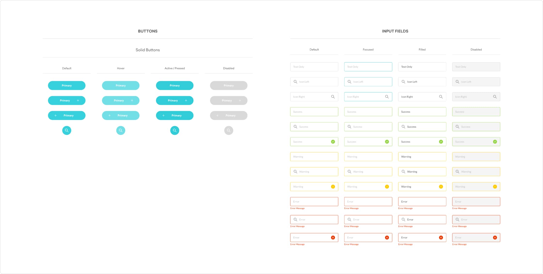
The first thing that I did was to inventory every UI element and style in our designs and make sure that everything is in a single Figma file. This allowed me to check for duplicates or repetitive UI elements that were not used as components.
Once everything is in one place, I have grouped them into categories and deleted the duplicates and turned the repetitive elements into a single component. In addition to this, I have decided to organize and introduced new text styles and color styles to promote accessibility in our design system.
The most tedious part of the process was to name and rename the components and local styles. I had to make sure that the elements are properly grouped and categorized.
After the time-consuming and tedious process of building a design system from scratch, we have finally documented our design tokens and components. In addition to this, we made sure that our practices were also well-documented to guide, not only the product team but everyone in the company.
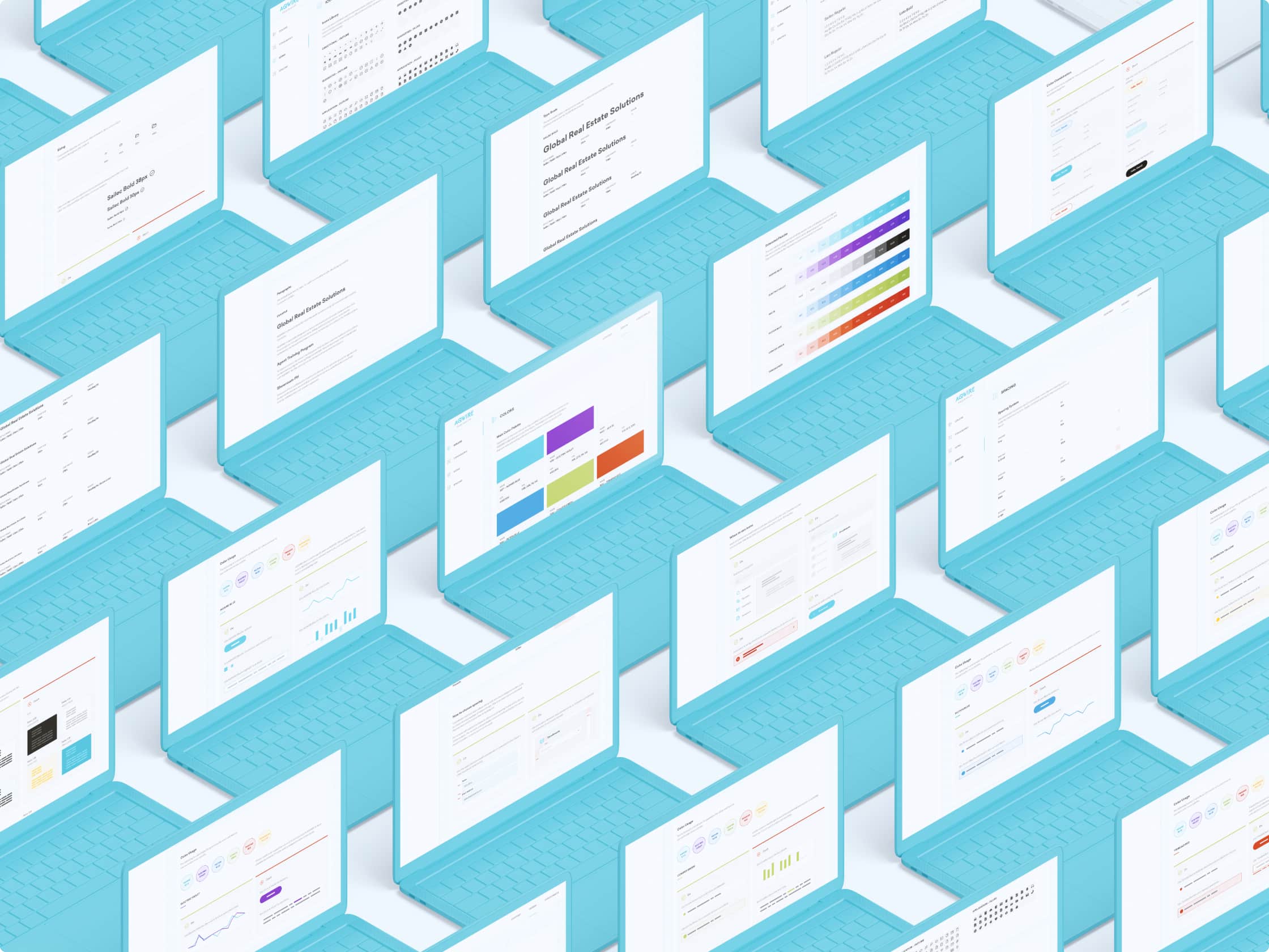
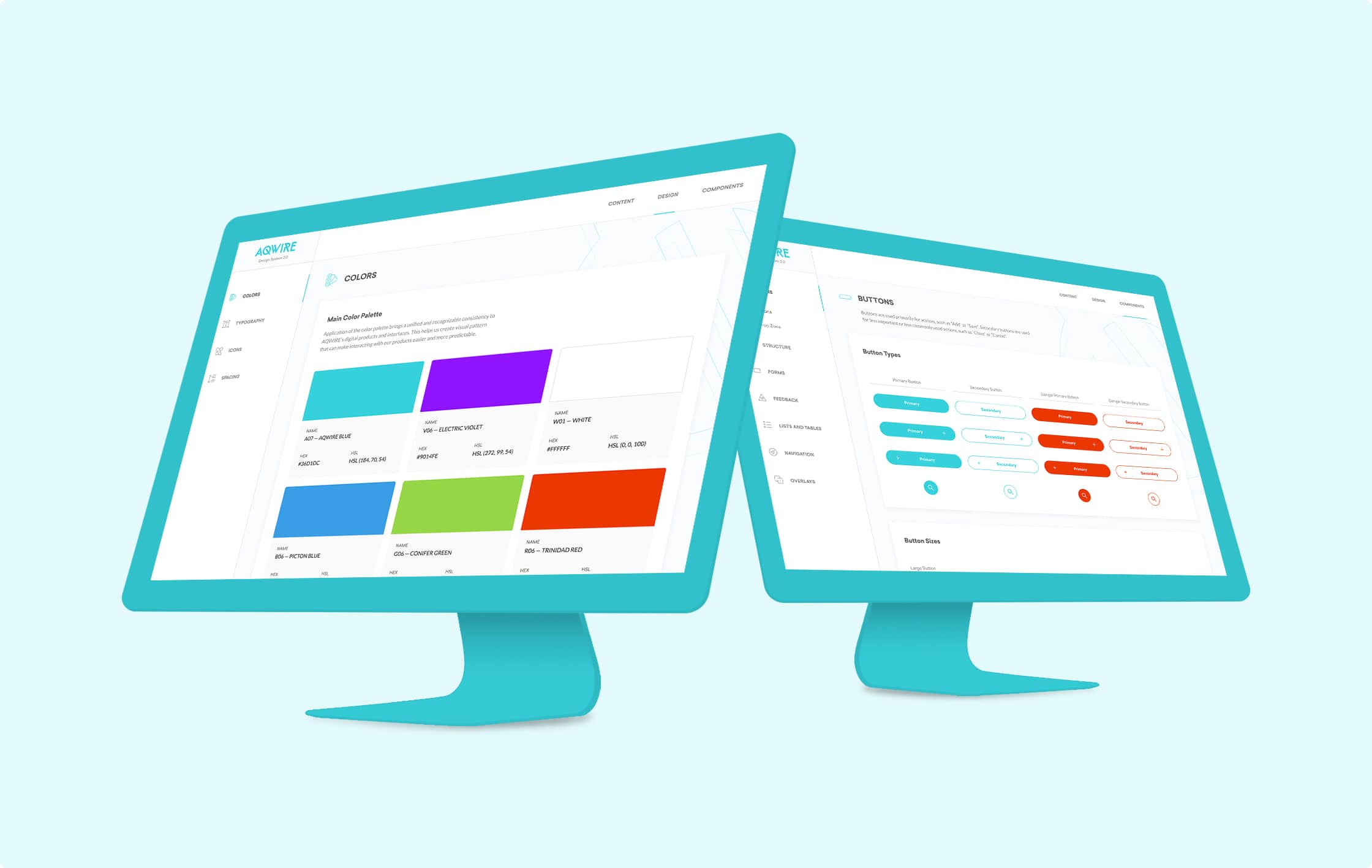
Design Page is where our design tokens are documented. Design tokens are the visual atoms of the design system. This includes rules and guidelines for our colors, typography, icons, and spacing.
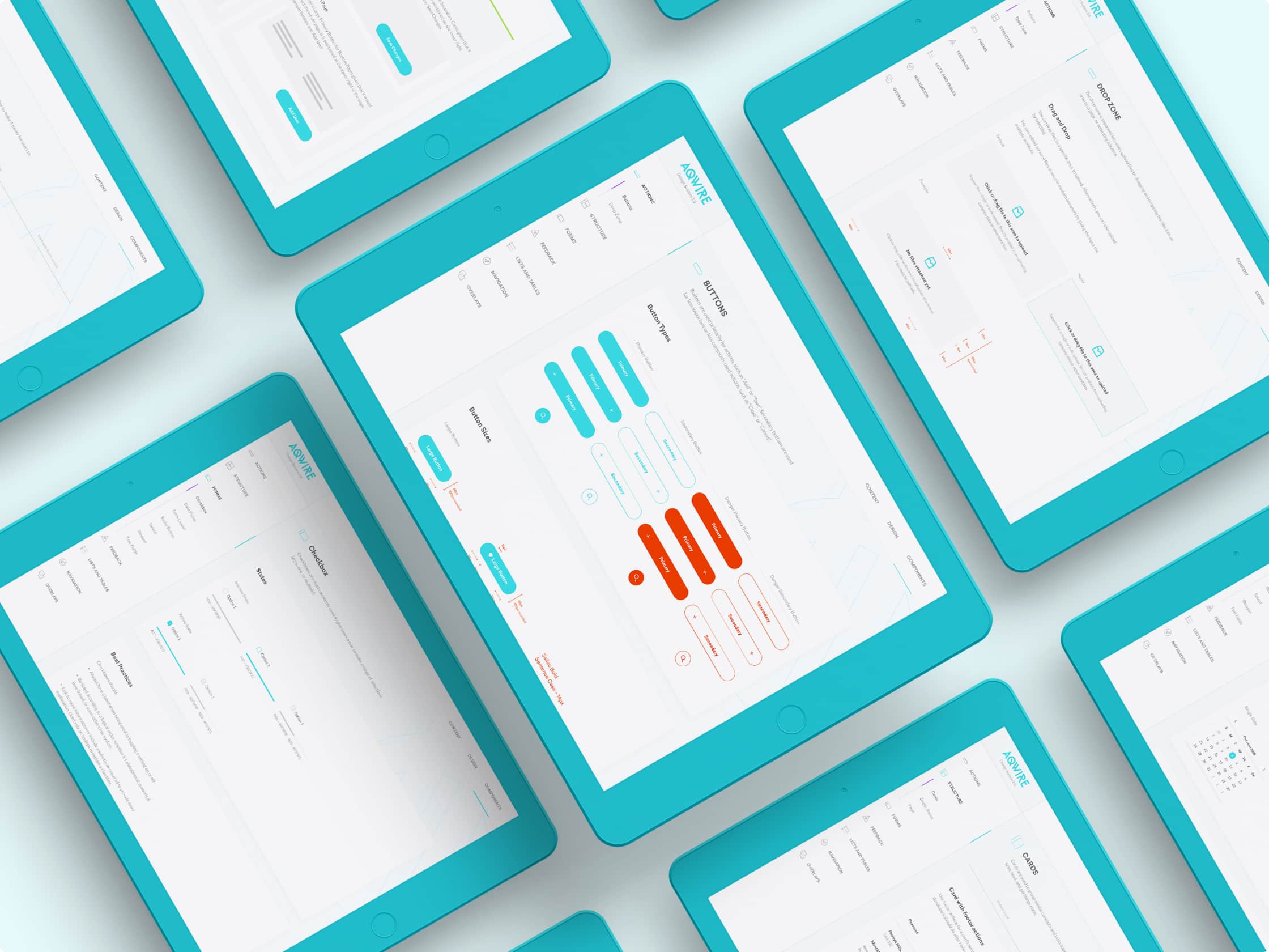
Components are well-documented in the design system. Not only we documented the design specifications for each component, but we also included best practices and guidelines on using it.
Building designs from scratch every time is a slow and painful process. It is inconsistent and difficult to maintain over time. For companies with a small team of designers, the design system helps in cutting the design time and helps us iterate faster. It allows us to focus more on providing solutions to the problems rather than focusing on creating elements again and again.
Moving forward, we hope to collaborate with the engineering team to standardize and implement code snippets for our components. Moreover, we want to be more inclusive and make sure that our design is accessible because we believe that design is for everyone.