Are we there yet?
Lights & Prism is a team of freelancers that offers high-quality and approachable digital and creative services that aim to provide an online presence to various brands.
Lights & Prism is a digital marketing agency built through the common passion and goal of three college buddies. They provide high-quality and approachable digital and creative services that aim to increase leads; provide an online presence to various brands.
Lights & Prism is new in the industry and wanted to establish a strong and recognizable brand. They needed their brand to show their values and vision, and to keep it fresh, modern, and young.
Lights & Prism’s goal is very simple and straightforward. They aim to provide high-quality tech, design, and marketing services to small to medium enterprises and non-profit organizations. Lights & Prism is here to give color to the ideas and to give back in the community.
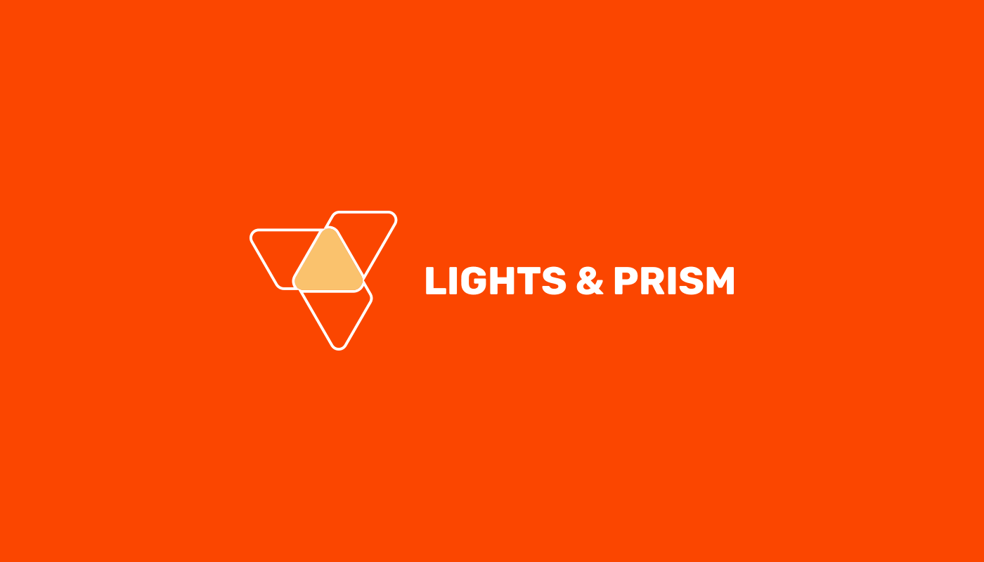
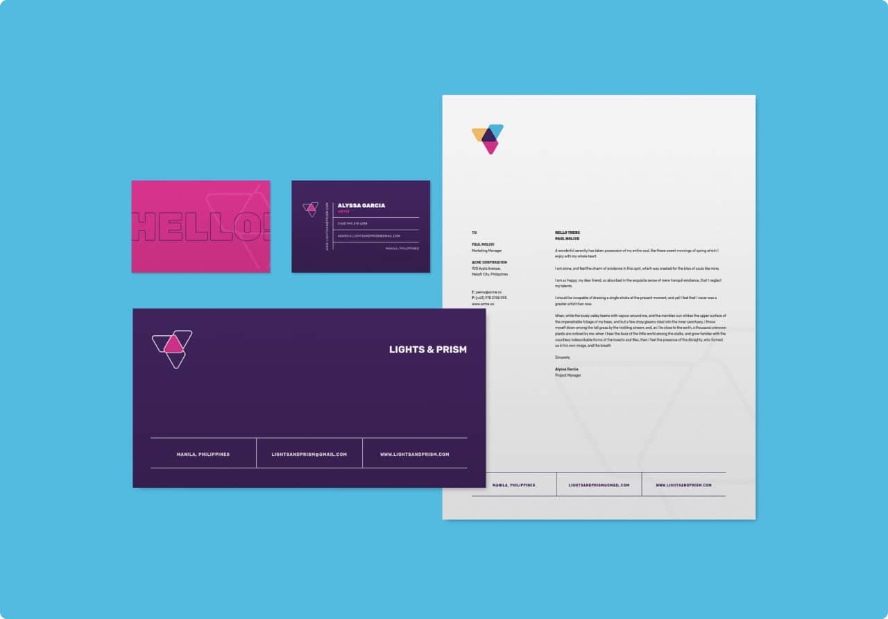
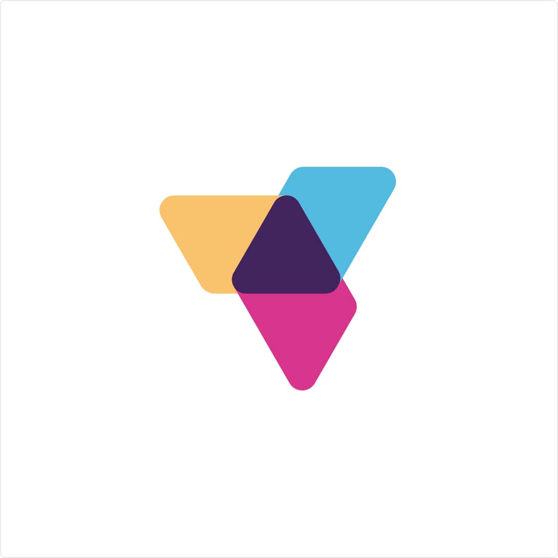
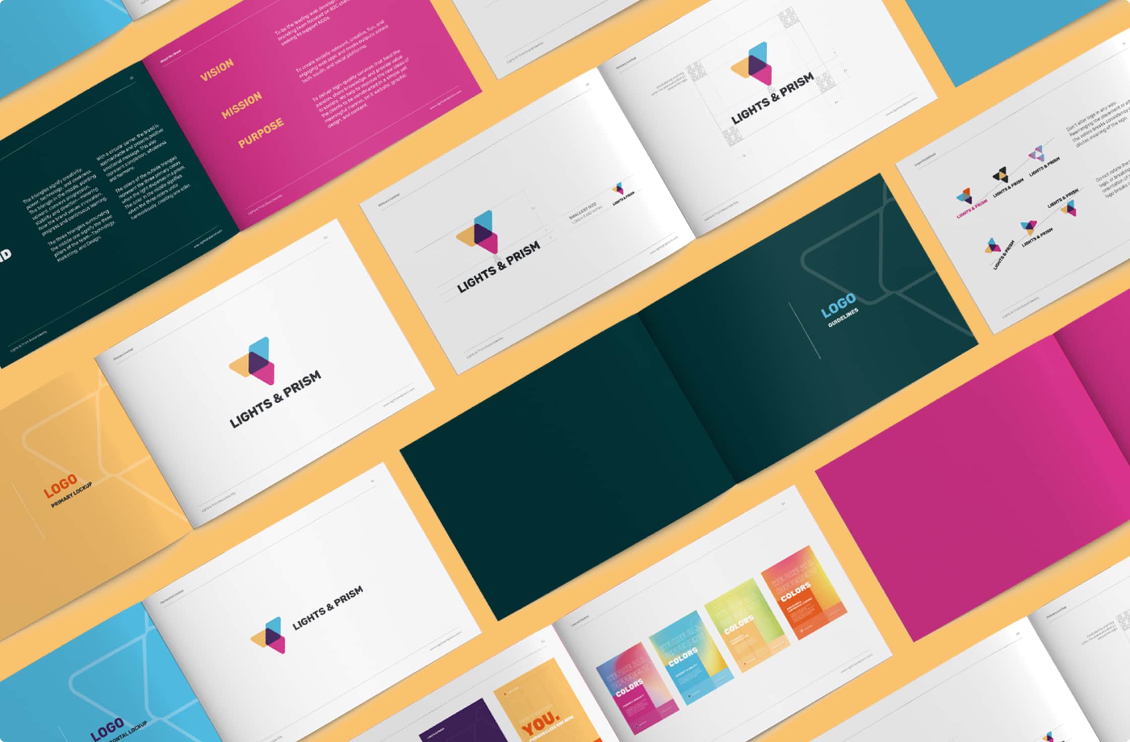
The triangles signify creativity, power, technology, and sleekness. The triangle in the middle, pointing upward, conveys progression, stability, and direction—mirroring how the brand values innovation, progress, and continuous learning.
The three triangles surrounding the middle one signify the three pillars of the team—Technology, Marketing, and Design.

Every element in Lights & Prism’s visual identity was intentional and was not designed for mere decorations. They were thoughtfully considered so that it would represent the brand and its vision.
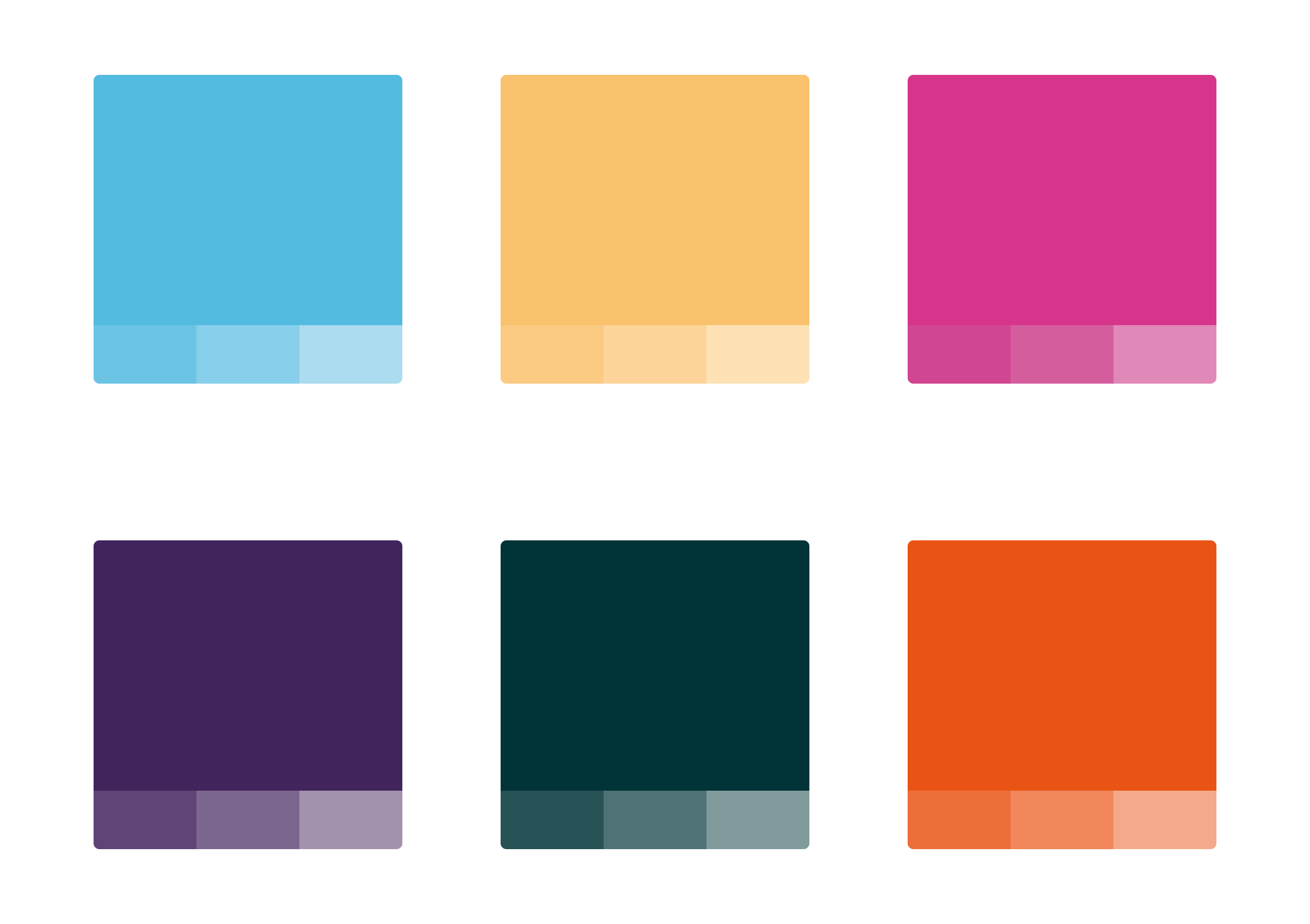
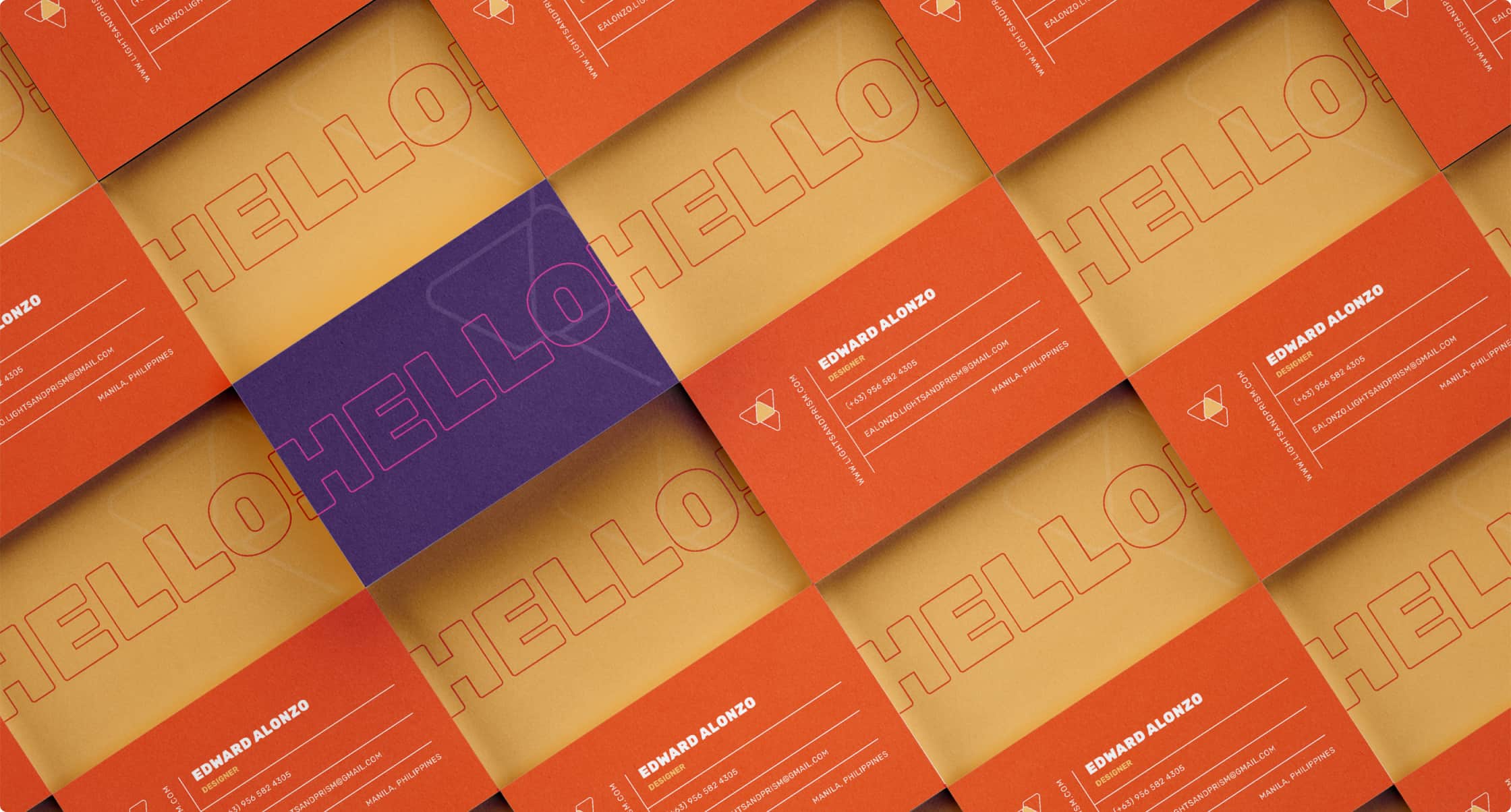
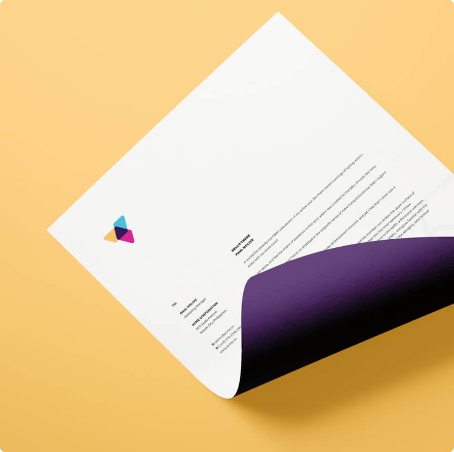
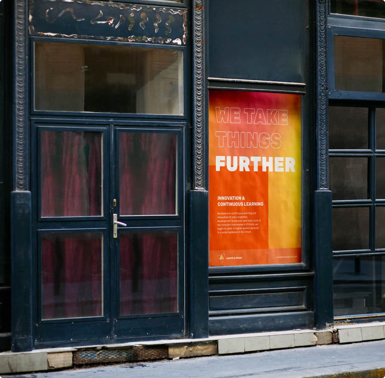
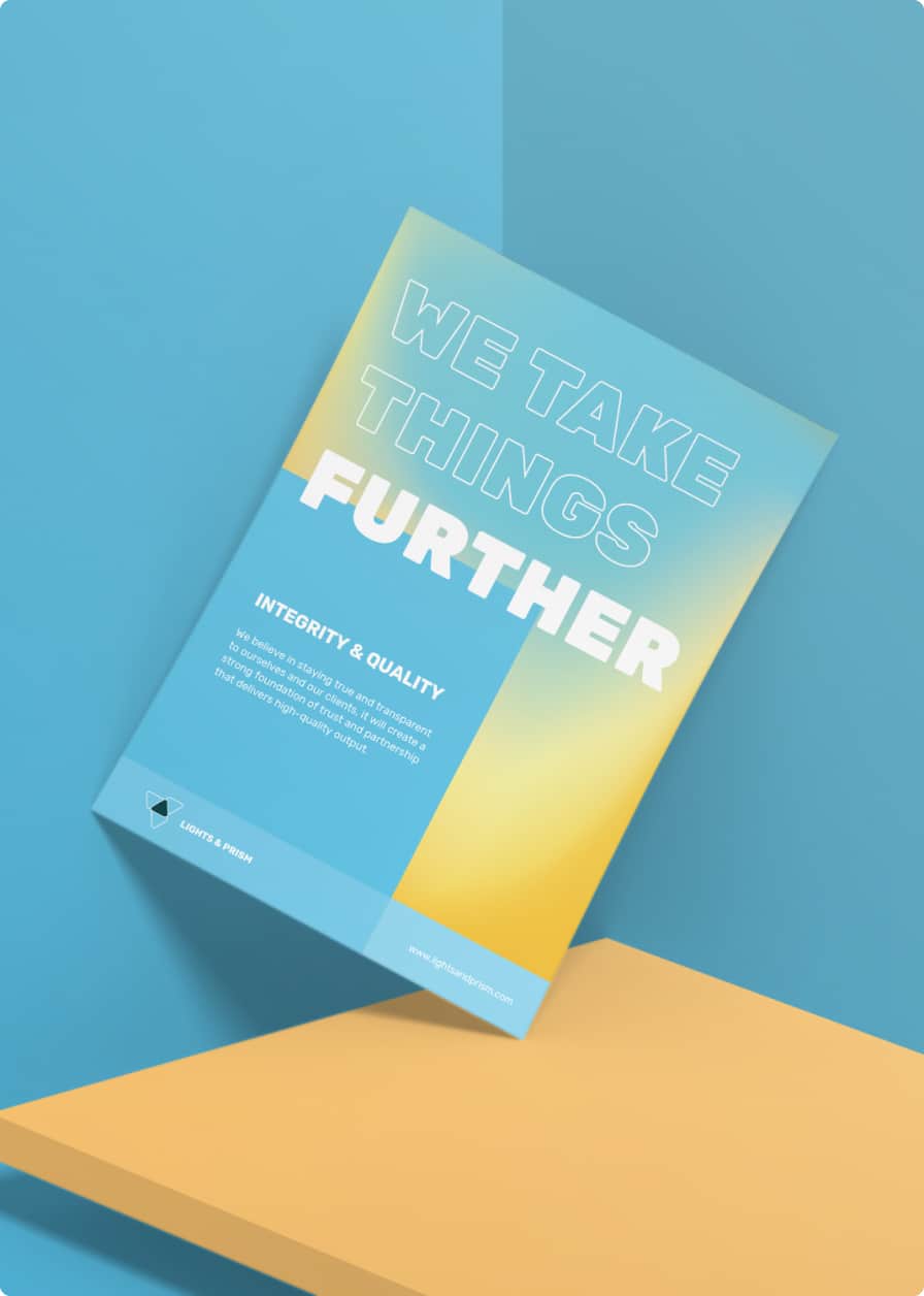
The color palette consists of a range of colors that came from when the light disperses from a prism. The vibrant colors reflect a fresh, young, and dynamic look for the brand. The extended palette allows for adaptability and accessibility.
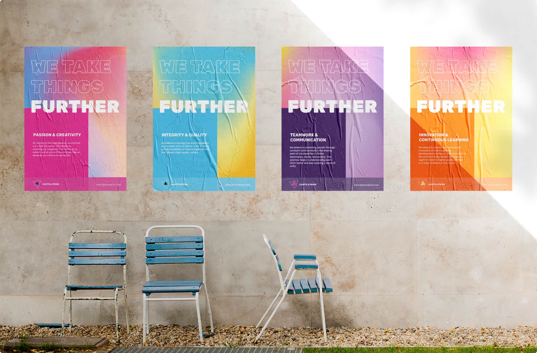
Within the brand palette, I have introduced the use of mesh textures as a background and accent. Each mesh texture is best paired with each of the colors in the brand palette.
For the typeface, I want it to be neutral and doesn’t dominate any elements. It communicates the message without any distractions. Rubik, a readily available on Google Fonts, was chosen because of its modern style and rounded corners to reflect the brand’s logo and to project a positive emotional message.
The approachability in the visual identity was extended to the brand’s verbal identity. It is approachable and friendly while staying professional. The brand’s voice makes sure that the audience feels included as if they are part of the team.
A comprehensive brand book was put together to inform how someone can represent Lights & Prism to its audience. This emphasizes the vision, values, and purpose of the brand.
The design exhausts the use of the brand’s visual identity to make it playful and approachable to its audience. Both visual and verbal identity of the brand is reflected across different collaterals—digital and printed.